Rituel Noir Collection
A cosmetic identity built around ritual, texture, and contrast.

We developed a darker visual direction across packaging, photography, and campaign materials for the product launch.
Rituel Noir Collection
Rituel Noir Collection

Industry
Beauty
Beauty
ROLE
Brand identity Packaging design Campaign art direction Product visuals
Brand identity Packaging design Campaign art direction Product visuals
Deliverables
Packaging system Campaign assets E-commerce visuals Print collateral
Packaging system Campaign assets E-commerce visuals Print collateral
TIMEFRAME
10 weeks
10 weeks
Rituel Noir Collection
Rituel Noir Collection
Challenge
Kicker
THE RITUAL
WITHOUT DECORATION
THE RITUAL
WITHOUT DECORATION
The product line needed a darker identity system that still felt refined and controlled.
The product line needed a darker identity system that still felt refined and controlled.
Obliqon wanted to move away from polished beauty conventions and create a visual language with more restraint, texture, and atmosphere. Existing references in the category felt overly ornamental and disconnected from the product experience itself. We designed a complete identity and packaging system focused on repetition, contrast, material behaviour, and controlled photography. Every element was built to support a slower, more tactile experience across packaging, digital commerce, campaign imagery, and print collateral.
Obliqon wanted to move away from polished beauty conventions and create a visual language with more restraint, texture, and atmosphere. Existing references in the category felt overly ornamental and disconnected from the product experience itself. We designed a complete identity and packaging system focused on repetition, contrast, material behaviour, and controlled photography. Every element was built to support a slower, more tactile experience across packaging, digital commerce, campaign imagery, and print collateral.
Solution
Kicker
The ritual
with restraint
The ritual
with restraint
The visual system was designed to make the product feel tactile, dark, and deliberate.
The visual system was designed to make the product feel tactile, dark, and deliberate.
Obliqon wanted to move away from glossy beauty conventions and create a darker, more controlled identity system. Existing references in the category often relied on decorative styling that distracted from the product itself. We connected packaging, photography, campaign assets, and e-commerce touchpoints through repetition, contrast, material texture, and negative space. The result feels slower, more physical, and visually disciplined across every format.
Obliqon wanted to move away from glossy beauty conventions and create a darker, more controlled identity system. Existing references in the category often relied on decorative styling that distracted from the product itself. We connected packaging, photography, campaign assets, and e-commerce touchpoints through repetition, contrast, material texture, and negative space. The result feels slower, more physical, and visually disciplined across every format.
A darker beauty identity focused on tactility, contrast, and restraint.
A darker beauty identity focused on tactility, contrast, and restraint.
Brand identity Packaging design Campaign art direction Product visuals
Packaging, imagery, and campaign assets were designed as one continuous experience where repetition and material detail carry the brand instead of decoration.
Packaging, imagery, and campaign assets were designed as one continuous experience where repetition and material detail carry the brand instead of decoration.
Packaging, imagery, and campaign assets were designed as one continuous experience where repetition and material detail carry the brand instead of decoration.
We don't pitch. We have a conversation.
Every project begins with a free discovery call. No commitment, no pressure.

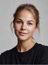
Natalie Kiedis
Client Services
We don't pitch. We have a conversation.
Every project begins with a free discovery call. No commitment, no pressure.
Natalie Kiedis
Client Services
We don't pitch. We have a conversation.
Every project begins with a free discovery call. No commitment, no pressure.
Natalie Kiedis
Client Services
SHARE PROJECT ON SOCIALS